Widgets

Building windows into eBay
When Apple announced support for widgets on iOS I was tasked with designing a framework to help guide our company to create beautiful widgets powered by tools within eBay. The assumption would be that widgets would increase engagement and mind share for eBay.
What are widgets?
Widgets are a window into existing functionality within a native app. They are best at conveying dynamic information and providing an entry point to an existing feature.
The Process
In principle, based on market examples and Apple’s design guidelines, widgets are the most successful when they take into account the following…
1. Widgets are designed to be glance-able, informative tools that don’t demand from the user, but do so with a very small amount of space. This means that knowing your audience and what is most important to them in their context is absolutely essential. You cannot succeed without knowing who it’s for and why.
2. Widgets are windows into an app’s features and market offering. Achieving this means being precise and surgical about value. Failure to do this is easy, and it’s even easier for a user to remove your widget after one bad experience. You only get one chance. eBay traditionally is very siloed internally and this leads to a lot of dissonance between areas in the application. Widgets forced a conversation about unity and horizontal thinking. It’s an opportunity for growth and collaboration between teams.
3. Widgets are both a tool and a brand presence, not unlike app icons themselves. If an app has achieved home screen status, it has a special place in a user’s mind. This means that your brand must be mature enough to be recognizable but also functional at the same time.
At the very start, I needed to identify what features in the eBay app best represented the value that eBay brings, what teams were responsible for those areas, and what use cases would benefit the most from a widgets utility.
I gathered together a set of principles to guide the conversation as I hosted multiple workshops with different domain teams.
The design principles I synthesized were as follows…
-
Widgets are designed to satisfy a specific need in the context of an idea in the product. Keep your widgets focused on solving a specific problem for users.
-
Widgets live within a very personal context for our users; their home screen. Make sure that your widget satisfies and delights in a pointed way targeted towards a known user’s needs. When a widget isn’t successfully personal, it will likely be unsuccessful.
-
Widgets act as a monitor or launchpad to a more detailed experience within the app. Use the least amount of information to provide utility or context to best utilize visual space constraints. A widget is not a app, but rather a window into an existing experience within the eBay app.
During these workshops we explored what widgets are, what they are not, what was the most valuable to that domain’s set of customers. These explorations would help us identify which use cases to focus on first.
Priorities
The biggest challenge with this project was getting concise on what was the most important for our users. Gathering that information was challenging, and varied in quality per domain team. Once this data was gathered it become much easier to solve the hierarchy challenge. Widgets are capable of many different size variations and since all space was valuable real-estate, understanding what data was additive and not critical to the function of a widget was the core problem to solve.
We gathered ideas and sorted by theme. We also filled out known user stories that would be relevant to the widget use case and sorted by expected impact.


Shown above, I broke up data elements into modular items. Together with each domain team, we debated which data elements were most critical to each use case informed by user interviews and our researchers. After many iterations we would come to a hierarchy structure for each widget as it scaled from small, medium and large formats. Sometimes this would lead us to a conclusion that a widget use case was only achievable with larger widgets, instead of all sizes. This realization directly informed the scope of the work for each widget.

Example of widget data structure for a market value widget. Red indicates critical information and yellow supportive.
As structures to data solidified, I was able to explore wire-frames of the data, keeping in mind how the hierarchy would visually scale as more widget real-estate was available.
Cohesion
In parallel with the use case synthesis, I also began to tackle the cohesion challenge. Widgets needed to look like they were from eBay while also having a design language that was versatile enough to be themed, customized, and data dense.
Dark and light mode explorations utilizing the ebay design system
Brand
During the visual exploration I encountered a couple of challenges.

The market perception of eBay’s brand historically was identified as just the word-mark, with no iconography or strong color associations. This would not be space efficient in these tiny canvases. This led to a collaboration with the brand and design systems team to find a way to signify eBay’s brand through iconography with the goal to make all widgets recognizable as part of eBay even with their content varying broadly.
Getting Feedback
After reaching consensus around best opportunities, and iterating with the brand and design systems teams, a family of widgets was produced for testing. We then demoed the widget family to users by conducting a study with our research team. We refined again, and concluded that the widgets that would have the highest chance of success were:
My eBay: View your watching, saved, bids and offers. Filter and sort to suit your needs
Seller Dashboard: Stay on top of your income, incoming offers, bids, active and sold items.
Search: Quickly access search tools like barcode scan, saved searches, and recent quires.
Each widget met a clear need to our buyers and sellers in their user journey’s, were clearly understandable as concepts, and received very positive feedback.


Here is the family together utilizing both light and dark mode as well is on device examples.
Seller Dashboard & My eBay


Seller dashboard displays a histogram of income over time, a common metric of success for budding entrepreneurs on eBay. Sellers can adjust time span as well as have quick access to their offers, bids, active listings and sold items.
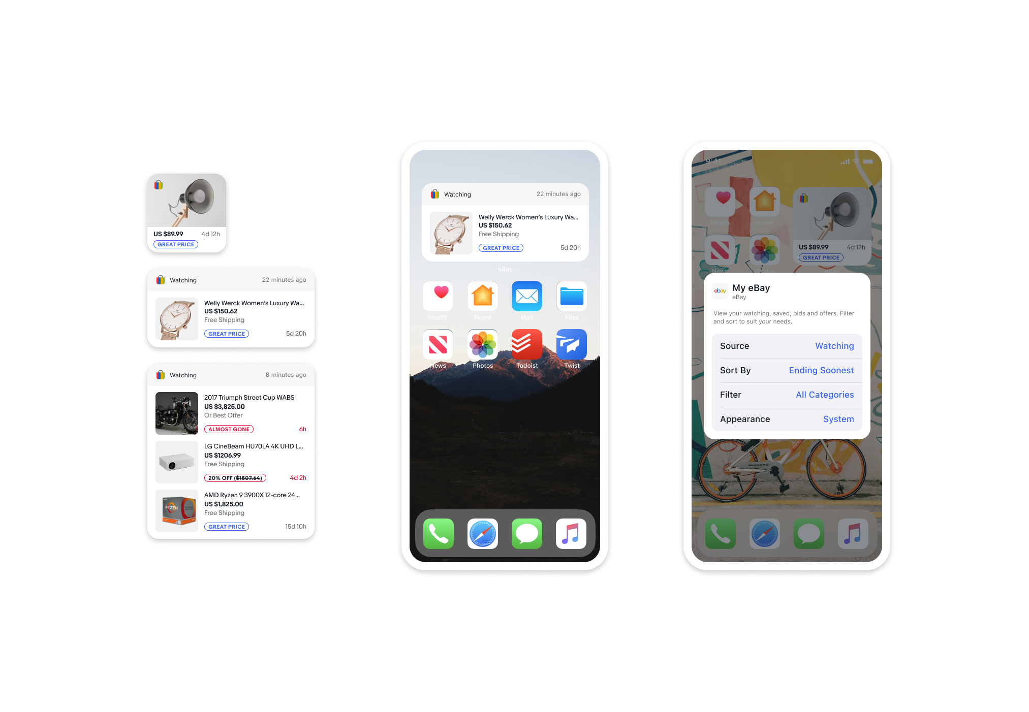
The My eBay widget was particularly versatile, allowing buyers to watch all of their monitored items at a glance. Many buyers gave us feedback that they would likely win more bids if they had this tool available. The greatest challenge was ordering and communicating the priority of the items based on their signals. In the end we followed the same logic that the watch-list within the app utilizes, ordering by most critically actionable at the top, to softer signals like “great price” at the bottom.
Bids, Offers, and Search


We were suprised to learn that Sellers were the most excited about the search widget. Specifically, search resignated with our sellers who often flip finds they source in the wild. Often when sourcing, a seller needs quick tools to assess value of an item before they decide it’s worth flipping on eBay. Quick access to features like camera search and barcode scan were perfect for this demographic and generated excitement during our testing.

Bids & offers orders the items by the remaining time in the bid window, showing the most pressing at the top, and other items with more time remaining below. If you are outbid, that also qualifies as a high priority item secondary to bid time remaining.
The Result
Sadly, despite ample positive feedback during studies and market demand for widget support, an insurmountable technical issue kept widgets from releasing indefinitely. They were developed, working and tested with users externally, but service side tech debt prevented a launch that would break immediately after release. Widgets were shuttered until such issues would be resolved.
Shown above is a interactive prototype of the framework documentation. It was intended to be integrated with the design system website. Doing this would help guide domain teams when creating new widgets in the future.

As someone who really enjoys a complex, multi-faceted challenge, eBay widgets was probably my favorite project at eBay. I had many opportunities to bring teams together, and collaborate and brainstorm with talented designers and researchers. The end result was a framework that allowed more teams in the future to add to our widget offering, while also pushing the brand to grow and mature for future needs.